The decades-long enshitification of the PayPal user experience
Bad UX isn’t about broken code. It’s about leaving users guessing and feeling responsible.

As a career long web professional, nothing bothers me more than thoughtless user interfaces. And as has been the case for decades, PayPal has failed miserably again.
For a company of their size, it’s one of life’s mysteries why they’ve never got it right. I could easily make a convincing case about how the PayPal user experience should be taught to young designers and developers as a prime example of what not to.
So what happened (this time)? I simply wanted to add my wife as a secondary user to my PayPal account. Following their official instructions seemed easy enough, except that any attempt to actually add a secondary email address failed with this very unhelpful warning:
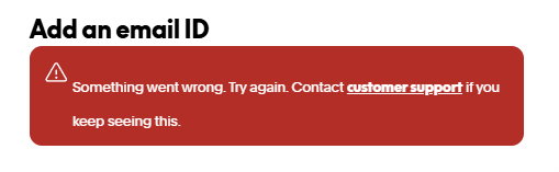
Subsequent attempts all failed, and the link to customer support was ultimately useless as the only help I could find was the original instructions I had already followed.
I was about to abandon my quest but thought it might be worth calling their support line for help. To their credit, I was talking to someone after only three minutes of drilling down in their comically long phone navigation.
The problem, Brad from PayPal support advised, was that you are not allowed to add a secondary email address of an existing PayPal account holder. His official solution was to use a different email address, and if my wife didn’t have one, then she should just create a free Gmail account.
That’s not a real solution, but putting the absurdity of it aside for a moment, let’s break down how PayPal has failed, and why to this day I strongly believe nobody at PayPal is familiar with user experience.
Why this is bad user experience
This is thoughtless user interface design 101. Not because of PayPal’s policy to disallow adding existing PayPal users (there’s probably a good reason for it), but because in the event of an error it refuses to explain the reason or suggest a solution. It’s this complete lack of a useful error message that makes it feel like something is actually broken.
Throwing a generic “something went wrong” message leaves you thinking you might have done something wrong. You double-check, triple-check everything and try again, but the same error keeps coming back.
How it could have been avoided
This entire situation: wasting my time, the anxiety, and wasting PayPal support time, could have been prevented with one line of text:
“You cannot use an email address that is already associated with another PayPal account. Please try again with a different email address.”
Even better, they could have mentioned it in their official help article – the one that currently gives you step-by-step instructions for doing something that won’t actually work for uninformed users like me. A single sentence or two explaining the policy and a suggestion would have saved time, confusion, and an unnecessary support call.
In summary
PayPal failed because they didn’t communicate anything helpful. A good interface (and support document) should inform and guide the user, not make them dig through dead ends for non-existent answers and to eventually call a support line (or log a support ticket) to get the advice that should have been part of the user experience to begin with.
PayPal should be doing everything in their power to make it easy for users to understand and solve simple problems like the one I encountered, at the very least as a way to reduce their own support back-log.
Do better, PayPal.
More ArticlesMike Ott
Michael is a veteran developer / web designer / usability evangelist, product engineer, former long time serving Judge for the annual Australian Web Awards and card carrying geek.
 Why wProject is a smart pick and why you’ll actually enjoy using it
  Spot Trends Instantly: Heat Map Now in Entry Reports Pro
  Introducing New User Verify
  How I’m stopping spam bot signups, and how you can help
  Scheduled Email Reports Have Arrived