My thoughts on Conversational Forms
Rocketgenius recently released Conversational Forms for Gravity Forms, and as a long time user I thought I'd take a look.

Nobody likes filling in forms, IRL or online. Thankfully online forms have become easier to interact with in recent years, thanks mostly to widespread browser support that allows us to populate form fields with data that we commonly use.
Rocketgenius recently released Conversational Forms for Gravity Forms, and as a long time user I thought I’d take a look. Oddly they appear to be late to the party as there are some third party developers (Common Ninja, WPMonks and Gconversational to name a few) who already have conversational form plugins that work with Gravity Forms.
As a web developer for more than 24 years who has developed and maintained more than my fair share of forms, I have some thoughts on the new add-on.
How you use this information is entirely up to you, and I offer it simply as thoughts you may want to consider before deciding to jump in.
Layouts
The conversation forms gallery demonstrates a choice of three layouts:
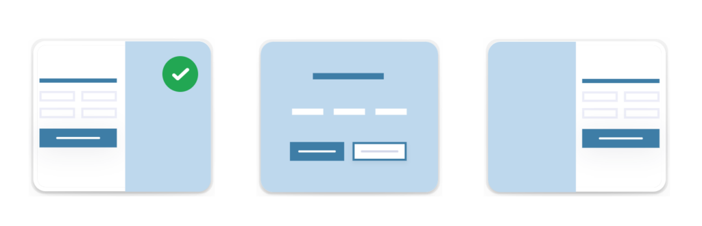
As expected, all three layouts launch in such a manner that they demand your immediate attention, which is the entire point.
While this is the essence of distraction free, which at first might sound like a good idea, they don’t provide an easy exit (aside from closing the browser or tab). This may not be such a bad thing depending on your use case.
Speaking of use cases, the intention here is that you would link to the form (from your website or some other marketing collateral) without the website being visible to distract the user. You wouldn’t (and probably shouldn’t) use a conversational form in place of a general enquiry form, as an example.
If you’ve ever seen a web form that launches in a modal window, then you’re already familiar with the concept of ‘distraction free’, and conversational forms are very similar except that you won’t see any evidence of a website.
The progress bar misnomer
Creating a conversational form offers a couple of progression types: Percentage or Proportion. But both are inaccurate representations of the form completion progress.
Percentage is as expected, a progress bar illustrating what percentage of the form you have ‘completed’:

Proportional displays how many sections you have completed in the form.

However both options are misleading because they only take into account the number of sections, not the number of fields. Let’s pretend you have a form made of five sections which would be displayed in 20% increments as you completed each section. The problem is that you might have a single field on the first section, but 6 fields on the second section, and more (or less) on the third, and so on.
In reality you are filling in fields, not ‘completing sections’, so you can quickly see the disconnect between how far you’ve progressed and how many fields you completed.
This common misrepresentation is also the cause of form abandonment. To cite a real-world example, I was recently asked to participate in a development survey which had ten sections. The first two sections contained only about five fields each. The third section contained (not kidding) 20 fields. The fourth section contained about the same, and this trend continued as I progressed.
When the progress indicator said I was 50% complete, but I felt I was probably really around 20% complete – or maybe less – it was impossible to really know. Not seeing an end (or reward) in sight can induce form anxiety, and like many others who came before me I chose to abandon ship.
An argument can be made that the developers should have distributed the fields more evenly throughout the form, which in turn would have allowed the progress indicator to be more accurate. But more often that not this isn’t the case because the standard accepted convention with big forms is to ease the user in by starting out small and eventually work your way up.
Forced CSS
I’ve never liked the way Gravity Forms looks (I’m not alone), and so I’ve always disabled the CSS option in favour of including my own SCSS partial. Something to bear in mind is that it also means Conversational Forms will not be presented as expected and are partially unusable, unless you re-enable the CSS option and consequently remove your own gravity forms CSS to avoid style conflicts.
Note: A quick check reveals the conversational forms do appear to have their own stylesheets, so it may be possible (speculation) to hook them in while keeping the core Gravity Forms CSS disabled.
Sections breaks and Pages are not honoured
If you have an existing form which has section breaks and/or pages and you want to convert it to a conversational form, said section breaks and pages will not be honoured. Sections will simply display the word ‘Section Break’ and pages will be ignored (but any fields that were in pages will be displayed). Thankfully conditional logic does appear to work though.
Navigation paradigms are ignored
While you move forward and backwards between form sections, the natural instinct for many is to use the browser controls to go forward and back. Navigational aids are provided in the footer but that’s not necessarily intuitive. I feel this is an important missed opportunity.
Checking your work is difficult
This limitation applies to any form that is broken up into sections or pages. When you can see a form in its entirety it’s easy to visually scan the fields to make sure everything is correct before submitting. But when a form is divided into sections you do not have this luxury, which punishes the user for no good reason.
Forms should always strive to be easier to use, not more difficult.
Don’t listen to me
Ultimately you should decide for yourself if conversational forms are a good fit for you. Speaking professionally I am unable to see where they could fit into my own workflow or that of any of my clients, but you may have your own legitimate use cases.
No judgement from me, whatever you decide.
More ArticlesMike Ott
Michael is a veteran developer / web designer / usability evangelist, product engineer, former long time serving Judge for the annual Australian Web Awards and card carrying geek.
-
![Rocket Apps Blog: A hard lesson learned about the importance of 2FA: Remembering when hackers stole from our savings account]() A hard lesson learned about the importance of 2FA: Remembering when hackers stole from our savings account
A hard lesson learned about the importance of 2FA: Remembering when hackers stole from our savings account
-
![Rocket Apps Blog: Now more than ever, start using a password manager]() Now more than ever, start using a password manager
Now more than ever, start using a password manager
-
![Rocket Apps Blog: Stop wasting time updating the same text in Gravity Forms]() Stop wasting time updating the same text in Gravity Forms
Stop wasting time updating the same text in Gravity Forms
-
![Rocket Apps Blog: About wProject 5.8.0]() About wProject 5.8.0
About wProject 5.8.0
-
![Rocket Apps Blog: A quick guide to creating usable Gravity Forms entry reports using Entry Reports Pro]() A quick guide to creating usable Gravity Forms entry reports using Entry Reports Pro
A quick guide to creating usable Gravity Forms entry reports using Entry Reports Pro
 A hard lesson learned about the importance of 2FA: Remembering when hackers stole from our savings account
  Now more than ever, start using a password manager
  Stop wasting time updating the same text in Gravity Forms
  About wProject 5.8.0
  A quick guide to creating usable Gravity Forms entry reports using Entry Reports Pro